
When authoring content I constantly run into the question of what image dimensions to use. In the world of print, image sizing is pretty straightforward. A print document has a set size, so the image dimensions on that document are fixed. On a web page, especially a responsive web page, the dimensions are likely not fixed and will scale based on the width of the browser window. There is a huge range of sizes to deal with on a web page, from a very narrow iPhone 5 width of 320 pixels to a 4K screen at 3840 pixels. This creates a big challenge when it comes to sizing CMS images.
In order to look their best, sites need to have clear, high quality, high resolution images. But high quality images come at a price in terms of download size. Google SEO includes page download size as a metric to determine ranking, and we don't want users waiting to download content as that seriously impacts bounce rates. You're going to want to scale images as small as you possible can as you need to smallest download without losing too much image quality. I like 1920 pixels as a maximum width since most users aren't browsing at higher resolutions.
Typically, hero banners have a large background image, and it is loaded in the CSS (Web Styling Rules) as a background image. Background images are one of two standard ways to display images in HTML, the other is using image elements (this one: <img>). For my example, I'm going to make the following CSS (the styling settings that control how the image is displayed) assumptions:
The "cover" setting keeps the aspect ratio of the image intact, and ensures that the image always fills the host container. In the example below the colored areas represent portions of the image that are not visible within the container. The image is scaled proportionately until fits.

At full width, the banner might stretch to double this width. The container height probably won't scale this way, as container heights are driven by content.
In this next example, I have tried to demonstrate a scenario that causes a lot of frustration for authors. At a high resolution, the banner stretches to a great width and the height stays unchanged. This creates a long and shallow container with a good deal of image clipping. The subjects of the photograph are partially obscured.

In a case like this, I recommend moving the focal point of the image by cropping it. The image above was downloaded at a width of 5760 pixels and then scaled down to 1920 pixels. By cropping and moving the focal point to the horizontal center, I achieve the following:

So this cropping works a lot better but I'm running into a zooming constraint, in order to increase the area at the top of the image I have to zoom into it which means increasing the size of the focal point area. I think I've pushed this image as far as I can, and if I had another image with a large focal point area this wouldn't work. I would have to try a different image.
Many authors request image size recommendations, or aspect ratios, but maybe a better guide would be including a "Focal Point Area" that describes the area the image subject should fit into based on all the possible (and likely) widths of the display container. The example image has a Focal Point area this is about 40% of the height and 60% of the width of the original image.

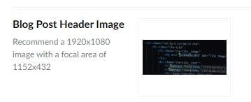
Umbraco allows you to provide a Field Description as does Sitecore so as a CMS developer I make sure to use this field to provide guidance for image scaling. Author guidance for image fields is a great way to use this description. Here is an example of the extra helpful focal point area along with a recommended image size.

Good luck with your image authoring and I hope this helped!
Photo by Alexis Brown on Unsplash